Reviews of trade paperbacks of comic books (mostly Marvel), along with a few other semi-relevant comments / reviews.

31 October 2008

Essential Marvel Horror, v. 1

Collects: Ghost Rider #1-2, Marvel Spotlight #12-24, Son of Satan #1-8, Marvel Two-in-One #14, Marvel Team-Up #32 and 80-1, Vampire Tales #2-3, Haunt of Horror #2 and 4-5, Marvel Premiere #27, Marvel Preview #7 (1973-7, 1979)

Released: November 2006 (Marvel)

Format: 608 pages / black and white / $16.99 / ISBN: 078512196x

Essential Marvel Horror, v. 1 gained its name, I was convinced when it was released, because Marvel was too squeamish to publish Essential Son of Satan (or Children of Satan).18

Marvel Horror features two protagonists: Daimon Hellstrom, Son of Satan, and his sister, Satana. Hellstrom, being a square who sides with “humanity” over “the forces of evil,” gets the bulk of the book, but his darker sister gets her share at the end. Unfortunately, the shift in tone and style between these two is likely to spin the reader’s head around like that girl’s in The Exorcist.

Essential Marvel Horror, v. 1 coverHellstrom is a rarity: an academic hero. (Ray Palmer is a professor; are there other superheroes who work for a university?) In his Marvel Spotlight series, he battles his father’s forces in St. Louis while being affiliated with Gateway University; in his Son of Satan series, he goes to work for the University of the District of Columbia. I prefer the Spotlight issues, written by Steve Gerber; they were consciously superheroic, with Hellstrom fighting a new supernatural menace each month and trying to keep the squares in St. Louis from learning about it. Why St. Louis? I don’t know, but it’s no goofier than fighting demons in New York City.

(Plus, Hellstrom transforms into his demonic alter ego by raising both hands with three fingers pointed upward, making the sign of his demonic trident. Yeah, right — laziest transformation ever.)

The eponymous title, which was mostly written by John Warner, seemed more crowded and more blatantly supernatural, treading ground already trammeled. Thematically, yes, it’s appropriate, but it’s less enjoyable, trying to tread the ground between the superheroes and Marvel horror mags.

And then there are issues of Marvel Team-Up and Marvel Two-in-One, the superheroist of the Marvel superhero comics. Hellstrom got his start in Ghost Rider, which wasn’t a straight superhero comic but was never incredibly far from it.

Gene Colan is perfect for this subject matter; unfortunately, he only does two issues. The other superhero artists … not so much. Not even one of my favorite superhero artists, Sal Buscema, really does the subject justice. On the other hand, they draw demons better than later artists, especially those involved in the Inferno crossover, who believed evil was best represented in Technicolor.

Satana, Daimon’s sister, was featured mainly in Marvel horror magazines. These stand out against the crowd; they are serious, drawn for a mature audience who doesn’t want to see superheroes. The plots are dark, and while they might not match the top of the horror market, they have a unified goal and show us the horror of a child of Satan gone wrong (or right, from Satan’s point of view). Not bound by the Comics Code or its usual kiddie audience, Marvel let the creators have free rein in subject matter and format, occasionally publishing illustrated texts that described Satana’s deeds.

I’m not entirely sure Chris Claremont, who wrote the bulk of the Satana stuff, was the right person for the job, for two reasons. One, his overwrought writing style, which was only beginning here, is more suited to the less serious and self-conscious superhero comics. And two, this is dangerous for him; Claremont loved writing powerful women, and in his later days, became obsessed with certain … well, let’s say tropes, because “fetishes” is a loaded word.

I won’t say the art in these issues are better, but I will say they are striking, while the Comics Code constrained the others so they were quite forgettable. Straying outside their usual bullpen for Satana’s stories, Marvel published contributions from international artists. Their work is moody, dark, vivid even in black and white. These issues really make the volume, and it’s a shame the rest of the book contrasts so sharply with it.

Since it’s Halloween, I’m legally required to answer this question: Is it scary? Well, the Hellstrom parts are decidedly not so. Marvel has neutered most of its dread evil Lords of the Afterlife and all of its demons so superheroes can fight them. The Satana parts? Let’s just say they feel nothing like a superhero story, with a definite sense that evil might win. That’s not enough to rescue the volume as a whole, however.

Rating: Angry pumpkin symbol Angry pumpkin symbol (2 of 5)

Labels: , , , , , , , , , , ,

28 October 2008

Batman: Vampire

Collects: Batman & Dracula: Red Rain, Batman: Bloodstorm, and Batman: Crimson Mist (1991, 1994, 1998)

Released: December 2007 (DC)

Format: 288 pages / color / $19.99 / ISBN: 9781401215651

I had heard of the trio of Elseworld — or “Tales of the Multiverse,” as the cover says — stories that make up Batman: Vampire a long time ago: three stories of Batman and vampires. Although the idea didn’t immediately grab me, I admit I was interested to see how the concept translated onto the comic page.

Writer Doug Moench has constructed an interesting trilogy, although I don’t think it was planned as such; “Batman & Dracula: Red Rain” seems like someone decided Batman vs. Dracula would be a fun story to write or draw and went to it. It’s hard to blame them: how often do does a writer or artist get a chance to write about a world where Batman takes on vampires and becomes one himself? Thankfully, “Batman: Bloodstorm” and “Batman: Crimson Mist” show someone noticed the idea had more possibilities than were covered in “Red Rain.”

Batman: Vampire cover
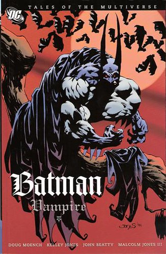
I was disappointed in “Red Rain.” I found Batman to be little more than the generic hero for the story. Other than the “bat” link between hero and villain, there’s not much to the conflict that couldn’t have been filled by some other street-level hero. Perhaps I am unappreciative of some natural link between vampires and Batman; perhaps I’m not properly reveling in the additive property awesomeness that results in super awesomeness when you add Batman to vampires. But the plot feels like a cheat, with Tanya, a vampire who fights against Dracula, imparting vampiric strength and attributes to Batman and starting him down the road to his eventual transformation. There’s also a mysterious red rain that literally falls from the sky here and throughout the book; I think it’s supposed to add to the spooky atmosphere, but mainly it looks like a coloring error.

The highlight of the trilogy is the middle tale, “Bloodstorm.” This is a real Batman story, no doubt about it. Batman is a full vampire now, battling more vampires and his urge to drink blood. This time, the vampires are led by a (still-human) Joker. So “Bloodstorm” is still a supernatural tale, but with the added spice of the demented genius of the Joker vs. Batman … well, now you have something special. There’s also Batman dealing with his internal demons — what separates him from evil now, and how long can he keep it between him and the dark side — and with the love of a good woman.

“Crimson Mist” wraps up the trilogy, and as sometimes happens in What If? stories, most of the thematically appropriate characters get thrown into the fire and consumed. In this case, all possible Gotham, vampire, and Batman loose ends are burned to ash, and then the Earth is salted so that no one can return to this Elseworld again. I’m not a particular fan of that sort of story — it seems a waste, and it lacks imagination — but I would be hard pressed to deny that it’s appropriate.

Penciller Kelly Jones’s art is interesting. Elongated, distorted and twisted figures of evil and darkness dominate the page, as if they are transforming or our perceptions of them are altered by fear. (The ears on Batman’s cowl grow at an alarming rate as well.) Jones saves this style for when it would have the most impact, so it doesn’t look like a proto-manga attempt at Batman and vampires. His Alfred seems to vacillate between tall and thin and dumpy with a fat face, though, making it hard to identify him some times. I’m not sure why that is.

This is a good collection for Halloween or if you’re a vampire or Batman freak. Or an Elseworlds / What If? fan. I don’t really fall into any of these categories, so Batman: Vampire falls just short of being outstanding to me. But the idea is compelling, and after a slow start, it feels right.

Rating: Batman symbol Batman symbol Batman symbol (3 of 5)

Labels: , , , ,

24 October 2008

Spider-Girl Presents The Buzz & Darkdevil

Collects: The Buzz #1-3 and Darkdevil #1-3 (2000-1)

Released: August 2007 (Marvel)

Format: 112 pages / color digest / $7.99 / ISBN: 0785126015

As you might guess from the title, Spider-Girl Presents The Buzz and Darkdevil is neither flesh nor fowl nor good red Daredevil.

This is what happens when you join together two three-issue miniseries starring third-rate characters, even if the minis have the same creative team and they both appear as supporting characters in the same low-selling title. The good news is that with writer Tom DeFalco and penciller Ron Frenz (the two co-plotted both minis), you know what you’re going to get, and while I doubt DeFalco / Frenz will ever rival Alan Moore / Dave Gibbons (or Dave Lloyd or Gene Ha or …), the collaboration isn’t going to be bad either.

Spider-Girl Presents The Buzz and Darkdevil cover
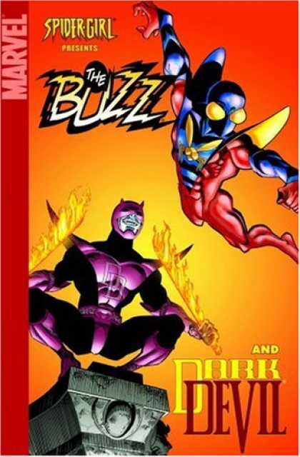
So that leaves the question of whether Buzz and Darkdevil is forgettable or fun, and it’s a split decision. This digest is meant to appeal to hardcore M2-Universe fans, what few there are: the kind of people who have been curious as to what Darkdevil’s deal is. (Until I read this, I never really considered the Buzz to have much of a mysterious backstory.) The usual caveat is M2 stories appeal to those who enjoy old-school comic-book stories, but that’s not really the case here. The Buzz is that sort of story, a fun little bit of fluff full of team ups, mistaken identities, and a classic villain using his only pseudonym. It’s not going to get written up as one of the great stories of the decade, but it is an enjoyable example of the genre; it would fit into the ‘70s / ‘80s Marvel output with no problems.

Darkdevil, however, clashes with that. DeFalco uses the old Daredevil vs. Kingpin battles as a reference, but then he throws in Clone Saga characters from the ‘90s and supernatural elements grafted onto Daredevil and scientific equipment out of the origin of Spider-Woman. It’s an uneasy fit, at best. DeFalco has a habit of trying to hammer the Clone Saga into M2 continuity, and I think that’s misguided. I know DeFalco put a lot of work into the Saga when it came out in the ‘90s, but now it’s reviled, and for those who don’t remember the story, it’s needlessly complex. You get Scriers, clones, Kaine, and the sons of clones … and then you throw in Zarathos, the Spirit of Vengeance from Ghost Rider. It ends up being a bit of a mishmash, and a forgettable one at that.

The good news is that at the former digest price of $7.99, it’s still a good deal. Frenz’s clear pencils and old-school inks from Sal Buscema (Buzz) and Al Milgrom (Darkdevil), combined with bright colors (even in the supernatural / dark themes of Darkdevil), hold up well in the smaller size.

Still: this is mainly for those who follow the M2 universe. Or if you like What If? / Elseworld titles. Now, if you want to go through the Spider-Girl titles to build an appreciation for Buzz and Darkdevil, well, I can recommend that.

Rating: Marvel symbol Marvel symbol Half Marvel symbol (2.5 of 5)

Labels: , , , , , , , ,

22 October 2008

Marvel's January solicits and Trade Talks schedule

Here are the books I’m thinking of getting from Marvel’s January 2009 solicitations:

Spider-Girl, v. 10: Season of the Serpent: Marvel must have heard my plea for more Spider-Girl volumes and finally decided to release v. 10, more than a year after v. 9. (Of course Marvel was listening to me and rushed this volume into production. No, of course they didn’t have this in development already. That’s crazy talk. What are you, crazy?) I’m not enamored of the new digest price of $9.99, but it’s better than no Spider-Girl reprints at all. Season of the Serpent covers #52-9.

Essential Punisher, v. 3: I have no idea how long I’ll remain interested in the Essential Punishers. Repetition has to set in soon, but the previous volume was surprisingly entertaining, and I’ll keep getting them until they stop being entertaining. Reprints Punisher #21-40 and Annuals #2-3.

Ruins #1: Not a trade paperback, but it does collect Warren Ellis’s Ruins, which is his answer to Kurt Busiek and Alex Ross’s Marvels. Ellis takes Marvels and squeezes it until all the hope is gone, then takes glee in repeatedly injecting its eyeballs with liquid depression. Still, I read #1 almost a decade ago after finding it in a quarter bin, but I hadn’t found #2 (of 2). (Back-issue prices are innnnnsane!) It’ll be nice to finally find out how it ends: I’m holding out for a happy ending.

This week is a digest week; Mini Marvels: Rock, Paper, Scissors was the Tuesday review, and Friday is Spider-Girl Presents The Buzz and Darkdevil. Yes, that should be a crowd pleaser. Next week is, of course, Halloween, and that means ostensibly scary stuff: Batman: Vampire and Essential Marvel Horror, v. 1. After that, I’m not sure, but I’m thinking of changing the format a little, and the books I review will probably be from Carrier Library’s graphic novel collection. That means more DC and more books focusing on women and minorities, because that’s one of the emphases of the collection. Or, I suppose, two emphases.

Labels: , , , ,

21 October 2008

Mini Marvels: Rock, Paper, Scissors

Collects: Varioius Mini Marvel strips and backups (2002-3, 2007-8)

Released: July 2008 (Marvel)

Format: 96 pages / color digest / $9.99 / ISBN: 9780785132110

It might surprise some when I say that the most enjoyable trade paperback or hardback graphic novel I have read this year is Mini Marvels: Rock, Paper, Scissors by Chris Giarrusso.

Some of you might not have heard of Mini Marvels; most probably haven’t heard of Giarrusso. In 1999, Giarrusso wrote and drew a series of comic strips for Marvel’s Bullpen Bulletins page; called “Bullpen Bits,” it featured elementary-school editions of Marvel’s heroes and villains. In 2000, Bullpen Bits faded from view, but in the intervening years, longer stories have appeared as backups in various Marvel titles. Mini Marvels even managed to get its own comic specials from time to time.

Mini Marvels: Rock, Paper, Scissors coverMini Marvels still shows its origins as a superhero version of the classic newspaper comic strip, although unlike today’s newspaper strips, it’s funny. The influence of Charles Schulz’s “Peanuts,” seen from early “Bullpen Bits” to Mini Marvels (Giarrusso’s Xavier looks like a cross between Jean-Luc Picard and Charlie Brown), is obvious. But despite the comic-strip roots, Giarrusso makes the transition to longer stories effortlessly.

It would be easy for Giarrusso to pound one joke into the ground, over and over again, until you just wish you could go back in time and break Jim Davis’s hands before he created “Garfield.” That’s not the case here; Giarrusso’s parodies the Marvel Universe, and by God, he’ll travel all over the Marvel Universe for his jokes. His standby is classic Spider-Man continuity, with Spidey as a paperboy who has to deliver to the homicidal Green Goblin’s house and contend with his paperboy rival Venom. But there are also stories based on Spider-Man’s Iron Spider armor, Planet Hulk / World War Hulk / Illuminati, and the continuity from the animated X-Men: Evolution. If you like obscure characters, well, so does Giarrusso; there are plenty of second-rate heroes and villains in the background of crowd scenes, especially in the “Paperboy Showdown” story.

Giarrusso’s Hulk is adorable and hilarious. It’s clear Giarrusso identifies with Hawkeye and Colossus, but Hulk steals the show in any story he’s in.

Interestingly, there is more depth to Mini Marvels than you might think; Giarrusso wittily satirizes current Marvel stories. Also, on a second reading, I kept finding jokes I didn’t see the first time. And on a couple of instances, what I had originally read as amusing throwaway jokes were actually well set up payoffs for earlier gags. (“All funds, said and dunds!”) Even the title comes from an obscure — but funny — background gag in the “Round Trip” story.

That’s not to say Mini Marvels does not suffer from drawbacks. But there aren’t many. The $10 price tag is a bit steep for less than 100 pages in digest size. Giarrusso uses a couple of jokes that are Twisted Toyfare Theater standbys — for instance, Daredevil is really blind and Aunt May can’t figure out Peter is Spider-Man, even when he’s in full costume. Each is used only once, however, and the Daredevil joke is a tiny throwaway on the front cover of the first printing. And that’s about it, really.

Demand outstripped supply on this one, with the first printing selling out so quickly Marvel rushed a second printing to press with a Wolverine cover. (They’re hedging their bets there, aren’t they? Wolverine always sells, even in adorable childlike versions!)

I cannot wait until the next volume of Mini Marvels comes out. I hope the success of Rock, Paper, Scissors makes Marvel consider coming out with a digest of original Mini Marvel comics, just so I don’t have to wait so long for another volume.

Rating: Marvel symbol Marvel symbol Marvel symbol Marvel symbol Half Marvel symbol (4.5 of 5)

Labels: , , ,

17 October 2008

Fables, v. 10: The Good Prince

Collects: Fables #60-9 (2007-8)

Released: June 2008 (DC / Vertigo)

Format: 240 pages / color / $17.99 / ISBN: 9781401216863

Fables, as I mentioned in my previous review, tells the story of characters and creatures out of legends and fairy tales who have made their way to our world as refugees from a world-devouring Adversary. In Fables, v. 10: The Good Prince, one of the Fables tries to reclaim a conquered kingdom for the first time as the rest of the Fables prepare and wait for war.

Fables, v. 10: The Good Prince cover
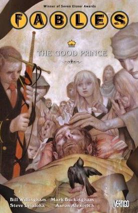
Writer Bill Willingham’s plot is essentially divided in two: the ramping up of tensions and revelations to what looks like an inevitable war and the story of bumbling janitor Fly, who becomes King Ambrose. The war preparations are more interesting; here, long-term hints are confirmed or denied, further threads are spun, and pieces are put in place for the final conflict. This is the path the series has been journeying down for six or so years, and it dominates the first half of the book.

Fly’s story, which occupies the second half, is a dead end, in which Fly goes to meet his destiny against the Adversary’s forces. After Fly arrives at his destination, his battles are seemingly effortless; he does what he wants, and the Empire’s troops are helpless to stop him. There’s little suspense here, even in whether Fly lives or dies, because either way, his story ends here. Mainly it seems an exercise in making the Adversary’s armies a more even match for the mobilizing free Fables.

Mark Buckingham does his usual great job on art, with an amazing amount of detail. As I said in my review of Fables, v. 7: Arabian Days (and Nights), I love his gorgeous art, with its smooth line and outstanding range. I still can’t help marveling over the page border art Buckingham designs for each setting in each issue, with the art occasionally taking over the border space if needed.

Also included is a one-issue story (#64) that focuses on Snow White and Bigby’s cubs learning the secret of their seventh sibling. It’s a nice change of pace in the middle of the book that doesn’t detract from the main plot. Aaron Alexovitch’s art is perfect for this more lighthearted tale; the art’s manga influences allow Alexovitch to show the exaggerated emotions of a pack of five-year-olds and Rose and Boy Blue’s awkward mutual crush.

Despite the unsatisfying chunks to the story, Prince keeps the story moving without derailing it. And until the big payoff, that’s really all we need, even if we hope for more.

Rating: Vertigo logo Vertigo logo Half vertigo logo (2.5 of 5)

Labels: , , , , , , ,

15 October 2008

Fables: 1001 Nights of Snowfall

Collects: Original graphic novel (2006)

Released: February 2008 in TPB form (DC / Vertigo)

Format: 144 pages / color / $14.99 / ISBN: 9781401203696

One of the cleverer ideas out of Vertigo — one that falls in neither the Neil Gaiman-derived property or character-reimagined-so-drastically-even-its-own-creator-wouldn’t-recognize-it camps — is Fables. In this series, writer Bill Willingham, usually assisted by artist Mark Buckingham, tells the story of characters and creatures out of legends and fairy tales who have made their way to our world as refugees from a world-devouring Adversary. Here, they stopped fleeing, and the story has been slowly building, through several volumes, toward a decisive conflict.

But Fables: 1001 Nights of Snowfall is a flashback — or a prequel, depending on your point of view — set before Willingham’s story begins. In Snowfall, Snow White, one of the leading Fables, travels to the land of the Arabian Fables to enlist their aid against the Adversary. Unfortunately, Snow is forced into the role of Scheherazade and tells the stories of the refugee Fables to spare her own life and instruct the king in morality and of the refugee’s plight.

Fables: 1001 Nights of Snowfall cover
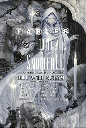
There are quite a few excellent stories that fill in missing pieces in some of the most prominent characters’ histories. The story of Snow White and the Seven Dwarves is recast as a revenge tale. Old King Cole, a merry old soul in prosperity, is shown as a good king in adversity. Frau Totenkinder, the grandmotherly villain of Hansel and Gretel, truly and frighteningly lives up to her name. Ambrose, the lowly janitor of the Fables’ apartment building, becomes a tragic figure after spending so long as bumbling comic relief; this story should be read before Fables, v. 10: The Good Prince, or it loses most of its emotional impact.

For long-time readers, this is a reward, a book that simply answers questions without the plot getting in the way. Readers who are unfamiliar with the story might get something from the stories, but the background of the series is necessary for the stories to have their intended impact.

These are excellent stories; I can’t praise them enough. Willingham takes some of the oldest characters around and recasts them again, after already recasting them at the beginning of the series. Most of the stories have a war-refugee theme that link them together, which fits the frame of Snow telling the Arabian king these tales. The imagination is impressive, and even if I don’t care for one or two of them, overall Snowfall delivers.

On the other hand, the art didn’t match the quality of the writing. First, there are as many different pencillers as there are stories, giving the book a hodgepodge, thrown-together look. Secondly, I don’t particularly care for the art styles of two of the most prominent stories — John Bolton’s painted art inexplicably makes Snow White look Japanese and everything else look like an optical illusion, and Tara McPherson makes everyone look like a 2-D cutout. Other than Charles Vess’s illustration of the framing text and James Jean’s work on Ambrose’s story, I don’t really like the rest. I realize I am making a stylistic judgment into a decision on the work’s quality, and strictly speaking, that isn’t fair. Many people will probably enjoy Bolton and McPherson, but their work stylistically distracted my attention from the story without adding anything to it that a more commonplace style would have.

And thirdly, speaking of distractions and Vertigo, when related to the art: there’s a fair amount of gratuitous nudity. Other than Vess’s and McPherson’s work, every story with a prominent female character displays a woman’s breasts, if not more. I may be a prude, but I don’t think every story requires female nudity without any male nudity. I know this is mature-readers material, but come on: there are limits. Also, after seeing Bolton’s work, I’ll never see the Disney princesses in the same way again.

Fables readers who skip this volume won’t miss any plot points, but they’ll miss some very entertaining work. They’ll also miss a great deal of eye-straining art, but you have to take the good with the bad sometimes.

Rating: Vertigo symbol Vertigo symbol Vertigo symbol (3 of 5)

Labels: , , , , , , , ,

14 October 2008

Columbus Day

No review today because of the sporadically observed holiday; reviews this week will be tomorrow (Fables: 1001 Nights of Snowfall) and Friday (Fables, v. 10: The Good Prince).

Labels: , , ,

10 October 2008

Astonishing X-Men, v. 4: Unstoppable

Collects: Astonishing X-Men v. 3 #19-24, Giant-Size Astonishing X-Men #1 (2007-8)

Released: August 2008 (Marvel)

Format: 200 pages / color / $19.99 / ISBN: 9780785122548

I was lukewarm on the previous volume of Astonishing X-Men, but I’m happy to say Astonishing X-Men, v. 4: Unstoppable is an improvement. (If they actually could have produced the issues on time, I could have said this earlier.)

Writer Joss Whedon and artist John Cassaday wrap up their run on the title that was essentially created for them, and the closure they give the title really helps give Unstoppable the emotional impact missing from previous volumes.

Astonishing X-Men, v. 4: Unstoppable coverAnd when I say “emotional impact,” I mean more than just the punch to the gut the death of a character gives. The characters complete their emotional arcs — Scott and Emma in their relationship, Wolverine teaming up, as he often does, with a young female X-Man (Armor), Hank and Brand — and although that last pairing smacks of Whedon trying to give some importance to a character he created, it does give the character some closure that will never be followed up on again. The incompleteness of Kitty and Peter’s reunion also hits hard, and it’s predictably the most moving part of Unstoppable.

Still, everything I said about Whedon in my review of Torn is still applicable here. (Especially the bit about the Mohs scale.) I don’t care about Breakworld, and I never will; the same goes for Agent Brand and SWORD, who are ill-suited for an X-Men title (despite what Chris Claremont probably believes). Whedon can write dialogue, filling the story with quips, but it makes the story feel padded. (And I’m not sure whether Cyclops’ new-found levity is supposed to be characterization or another chance for Whedon to add one-liners. Either way, I don’t buy it.) In the old days (the ‘80s), this story would have been a three parter, not stretched over six issues plus a giant-size special. Weirdly, despite the leisurely pace, the transitions are frequently abrupt, making me wonder if I had accidentally skipped a page; I also had to look up what happened to the heroes trying to stop the world-destroying bullet (yes, really) to confirm I was right.

There are some clever bits of plotting, including when Emma uses telepathy to connect everyone’s mind while they’re being surveilled. I’m not entirely sure how I feel about how the prophecy about Colossus destroying Breakworld plays out. I can see how it’s clever, but since I never was emotionally connected with Breakworld, it lost some of its impact. But when Scott springs his trap on Breakworld and says, “To me, my X-Men,” I almost forgave Whedon all his faults.

Almost.

Looking back on my review of Torn, I was really surprised how much I praised Cassaday’s work. It’s deserved, but there are times I look at his work, and it reminds me too much of Frank Quitely — not that I mind similarity or imitation, but Quitely’s work has always skeeved me out: those heads are not normal, and often, neither are Cassaday’s. Peter and Scott still look too similar, partially because of that. I’m also not sure he’s the artist you want drawing alien landscapes; perhaps part of why Breakworld doesn’t click for me is that Cassaday doesn’t make it visually unique. But Cassaday is excellent with characters and their design — his Spider-Man makes me want a Cassaday-drawn Spider-series — and although this doesn’t give him as much room to play with the characters as Torn did, it’s still excellent work.

Whedon and Cassaday leave on a high note and leave the slate clear for other writers. For Unstoppable, you couldn’t have hoped for much more.

Rating: X-Men symbol X-Men symbol X-Men symbol Half X-Men symbol (3.5 of 5)

Labels: , , , ,

07 October 2008

Howard the Duck: Media Duckling

Collects: Howard the Duck v. 3 #1-4, Howard the Duck v. 1 #1 (1976, 2007-8)

Released: April 2008 (Marvel)

Format: 128 pages / color / $11.99 / ISBN: 9780785127765

Steve Gerber was, after Jack Kirby, probably the most outrageously imaginative people to ever work at Marvel Comics. Among the many strange (and almost always commercially unsuccessful) ideas he had was Howard the Duck, a duck-like humanoid who found himself in a world of hairless apes: “trapped in a world he never made,” as the oft-repeated tagline said. Gerber used Howard in the ‘70s as an outside observer to drive home his satires and occasionally to break through his own creative difficulties.

It is easy to argue Howard should have been retired after Gerber had a falling out with Marvel over the character; certainly, no one has ever really made Howard seem to matter like Gerber did, and it’s difficult to imagine anyone pulling off the outrageous setups Gerber wrote monthly without seeming cheesy or idiotic. Even when Gerber resurrected Howard for a miniseries with Marvel in 2002, it didn’t quite reclaim the magic.

Howard the Duck: Media Duckling coverBut any character that has been good once is begging to be reused, and into this breach steps writer Ty Templeton and penciller Juan Bobillo. In Howard the Duck: Media Duckling, Templeton seems to have an idea why Howard is so perfect for satire: he can take himself seriously, but not the world of the hairless apes, and the hairless apes take themselves seriously but not Howard. So Templeton uses Howard to fire a scattershot of satire at media, pundits, human rights in the era of Homeland Security, and the Internet. Easy targets, for the most part, but Templeton gives Howard enough surly character to make it amusing.

Templeton also realizes Howard is part of the Marvel Universe but exists uneasily with it; accordingly, the only Marvel characters / concepts Howard interacts with are She-Hulk (a lawyer / gamma-irradiated Amazon) and MODOT (Mental Organism Designed Only for Talking, a creation of Advanced Idea Mechanics). The absurdity practically drips off the page.

I generally like Bobillo’s art, and I’m mostly pleased with his work here. His style is well suited for the book, with the lack of realism allowing him free rein, and he does a good job of capturing the general cloud of chaos around Howard. I suppose what I have trouble with is his design for Howard; oddly, Howard doesn’t look cartoony enough, and he looks like he’s either sick or wet throughout.

As a bonus, this trade paperback includes the first issue of the first volume of Howard the Duck, written by Gerber and with art by Frank Brunner. It’s interesting if you want to know how that series begins, but it doesn’t give the flavor of Howard as much as later issues of that series do. Brunner’s style is smooth and rounded, completely different from Bobillo’s, so the contrast makes Bobillo’s work look a little unpolished.

There’s also the Howard the Duck story from Civil War: Choosing Sides, which is a real treat. Written by Templeton, this amusing story captures Howard registering as a superhuman, despite having no superpowers. Those in charge tell Howard, appropriately enough, they aren’t interested. Roger Langridge’s art echoes Brunner’s quite well.

Gerber died on February 10, 2008, and Templeton dedicated this trade paperback to him.

Rating: Marvel symbol Marvel symbol Marvel symbol Marvel symbol (4 of 5)

Labels: , , , , , , , ,

03 October 2008

X-Men vs. Apocalypse, v. 1: The Twelve

Collects: Uncanny X-Men #376-7, X-Men #96-7, Cable #73-6, Wolverine #145-7 (1999-2000)

Released: March 2008 (Marvel)

Format: 312 pages / color / $29.99 / ISBN: 9780785122630

When I started buying trade paperbacks in earnest four years ago, I was obsessed with value — how many issues I could get for the dollar. I think X-Men vs. Apocalypse, v. 1: The Twelve would have made me very happy back then, with eleven issues for less than $20 at Amazon. That’s less than I would have paid for the individual issues.

X-Men vs. Apocalypse: The Twelve cover
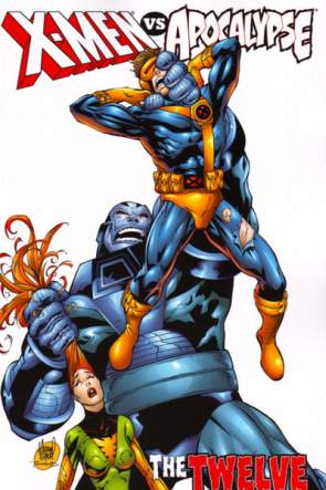
But Twelve isn’t actually a good deal, and you know why? Because almost two-thirds of the book is useless and irrelevant. If this collection had added the Uncanny X-Men and X-Men issues that preceded the ones included here and dropped Cable and Wolverine, this collection might have been worthwhile. I mean, it’s a simple story: genocidal, idiot-Darwinist Apocalypse and his religious-themed henchmen capture the long-prophesied mutants called the Twelve and try to drain their powers to make Apocalypse all powerful. But no, you’ve got to slog through ancillary stuff to get to the meat.

Wolverine #145-7 is a distraction to the main story, and without earlier stories, the tale of how Apocalypse made him “Death” and how he reclaimed his soul (or some such thing) isn’t important. Everyone at the time knew his turn to the dark side wasn’t going to stick, and everyone knows it eight years later as well. And then Angel, another former “Death,” takes over the Wolverine story with his struggles with what Apocalypse had done to him. No one cares about that; that was resolved years ago. Let it go.

The Cable issues are no treat. They too are irrelevant to the main plot, showing who the new “Pestilence” and “War” are but not much else. It doesn’t take four issues to do that, believe me. Cable #75 takes the cake: Cable, captured by Apocalypse, very briefly escapes and is recaptured; #76 takes place entirely in Cable’s mind and doesn’t move the story forward at all.

(The weirdest part of the Cable issues is that the art is split between enemy of perspective Rob Liefeld (#73 and 75) and Bernard Chang (#74 and 76), presumably because Liefeld needed the break. But Liefeld’s art is actually better. I’m not saying Liefeld is good, but his work has an intensity and seriousness Chang’s cartoony style can’t match. I mean, you have to deal with Liefeld’s weirdly creased faces — everyone’s faces fold inward toward the eyes — and perspective problems and odd feet and … well, you get the idea.)

And the lettering … I never mention lettering, a credit to the many professional, competent, occasionally brilliant people who have lettered comic books over the years. But the lettering in Cable — ascribed to “RS and Comicraft’s Said Temofonte” — is godawful. I’m assuming RS refers to Richard Starkings, and Starkings and Comicraft have done a lot of Marvel’s lettering over the past decade. But man, this painful stuff: an unconventional font that makes it seem Cyclops, Cable, Caliban (a simple-minded, mutated mutant), and Jean Grey all speak in the same tone. … I think this font is my least favorite part of Twelve, and that’s saying something.

The main issues are no picnic either. I know writer Alan Davis is trying hard, but without the proper setup and foreshadowing, the conclusion to Twelve looks slipshod. The four issues of the X-Men / Uncanny X-Men crossover seems to almost be as much about mutant Skrulls as about the X-Men themselves. The X-Men fall into Apocalypse’s clutches without putting up much of a fight, and they escape their prisons to stop by accident, not something they did. (You can argue it was a miscalculation on Apocalypse’s part, but I don’t believe it.) The cast is far too sprawling for a mere four issues, and it doesn’t help that some people pop in solely for the purpose of being used by Apocalypse and pop out for their own stories / plot convenience (Bishop, Mikhail Rasputin).

And the shifts in art styles throughout the books … Davis on X-Men, Roger Cruz and Tom Raney on Uncanny X-Men, Liefeld, Chang … There’s a different penciller on each issue of Wolverine: Leinil Francis Yu, Mike Miller, and Cruz. It’s a mess, and the artistic continuity is nil. Chang’s and Cruz’s exaggerated, cartoony styles contrast with Davis’s elegant pencils and Yu’s gritter realism. Raney’s style works pretty well with Davis’s, and Miller’s work is a good fill-in for Yu, but although Yu and Miller’s work appear in consecutive issues of Wolverine, they’re separated by three issues in Twelve. And then there’s whatever Liefeld does; that doesn’t play well with anyone at this end of the ‘90s.

Twelve could work as it was originally structured in the original core X-Men titles: meandering stories with a bit of foreboding, a bit of Skrulls, and a lot of Apocalypse. (And a goodly amount of Alan Davis.) Instead, with the tie-ins, well …

Sadly, despite knowing better, I’ll probably end up buying X-Men vs. Apocalypse, v. 2.

Rating: X-Men symbol Half X-Men symbol (1.5 of 5)

Labels: , , , , , , , , , , , , , , ,