Reviews of trade paperbacks of comic books (mostly Marvel), along with a few other semi-relevant comments / reviews.

30 November 2006

Thing: Idol of Millions

Collects: The Thing, v. 2, #1-8 (2006)

Released: August 2006 (Marvel)

Format: 192 pages / color / $20.99 / ISBN: 0785118136

Why do comic-book readers hate Dan Slott so much?

The Thing: Idol of Millions was originally slated to be the first volume reprinting the new volume of The Thing, written by Slott. Instead, when low sales prompted Marvel to cancel the series with #8, it became the reprint of the entire series. (Not really hate, I suppose, but disinterest isn’t a compelling emotion to write about.)

It’s a shame, too. Idol of Millions has the same wit and humor Slott displays in the (cancelled and revived) She-Hulk and GLA, and he works his sense of humor into low-angst, character-oriented stories. Slott is essentially a traditionalist; behind the book’s hook — the Thing is a billionaire — the stories hearken back to the days when the Thing starred in Marvel Two-in-One or v. 1 of his own book.

The Thing: Idol of Millions cover Almost every issue is a team up of some sort. Ben’s relationship with Alicia, long neglected, is at the fore, hinting at their reunion. The Fantastic Four is his family; Yancy Street is the past he can’t — and doesn’t want to — shake. Old villains from the Frightful Four pop up, just like Lockjaw, a frequent guest in the Thing’s first title. It’s just like déjà vu all over again.

The abrupt end to the series is apparent from the way #8 is constructed; there are two flashbacks to adventures that could have been full issues. Despite this, Slott makes the issue enjoyable, with plenty of jokes and a lighthearted tone that belie the imminent cancellation. Artist Kieron Dwyer, who also drew #6-7, keeps up with Slott’s humor (at one point, the green and purple Impossible Man, who can change his shape but not his colors, morphs into different heroes and villains from panel to panel, revealing the depth of purple and green characters in the Marvel Universe).

Actually, it seems Dwyer and Andrea Divito, who drew #1-5, had a great deal of fun with Slott’s scripts. Dwyer’s art is a little rougher than Divito’s smooth linework, and switching artists in the middle of a two-part story (#5-6) isn’t ideal, but Dwyer tells the story just as ably.

For such a light title, Slott uses a great deal of continuity. From the Sandman’s reformation (and forced counterreformation) to all the different robotic versions of the Hulk and Thing used by Arcade, each referring to a different period in their original’s career, it’s apparent Slott knows his Marvel history. (It’s evident in She-Hulk too.) Continuity isn’t popular at Marvel at the moment, but Slott uses it well, and it’s clear he doesn’t share his bosses’ enthusaishm for some changes — #6 reads like a good-natured poke at Spider-Man’s new status quo.

But continuity or not, it’s the humor that’s the selling point. And that’s what made Slott’s The Thing so entertaining.

Rating: Fantastic Four symbol Fantastic Four symbol Fantastic Four symbol Fantastic Four symbol (4 of 5)

Labels: , , , , , ,

21 November 2006

X-Force, v. 1: New Beginnings

Collects: X-Force #116-20 (2001)

Released: October 2001 (Marvel)

Format: 128 pages / color / $14.95 / ISBN: 078510819X

From the very first issue, it’s clear X-Force, v. 1: New Beginnings isn’t your Rob Liefeld’s X-Force.

It’s hard to imagine any more dramatic break with the ideas of the title Liefeld and Fabian Nicieza kicked off in 1991. First, there’s the flat, cartoony art of Mike Allred. Somehow, Allred manages to make his decidedly 2-D art full of more action and dynamism than Liefeld ever managed to inject into his grotesquely muscled and dramatically posed figures. Allred’s art was unlike anything else Marvel was publishing at the time (or now), dramatically setting X-Force apart from the rest of the catalog.

X-Force, v. 1: New Beginnings cover 
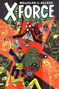
Peter Milligan’s writing took Allred’s art and made it seem even more frenetic than it already was. Allred’s “simple” art clashes nicely with Milligan’s post-modern, media conscious, slick plots and meta characters. There is an incredible difference between Milligan and Allred’s X-Force and the X-titles that came before: these aren’t angst-ridden mutants sworn to defend a world that hates and fears them. These are savvy, glitzy mutants who are flip and blasé in the face of missions that are far more lethal than anything the previous X-Force — or the X-Men — ever face. The first issue decimates the team; the next mission takes a heavy toll on the replacements and survivors.

When the issues reprinted here came out, many fans’ reactions were vitriolic, and the editors took great glee in reprinting the letters they received from fans who either didn’t like the new direction or didn’t get it. In this spirit, the back cover features blurbs from comic professionals (positive comments) and comics reviewers (negative). My favorites are from Tony Isabella (“Lord knows what hideous malady we may have caught from this most wretched creation” and Eric J. Moreels (“Below average”).

Comparing this to “average” comics is self defeating. New Beginnings is a new idea, a different way of looking at heroes — cynical men and women who risk their lives because of the rewards they can reap from it. It is a mutated sense of noblesse oblige, which Zeitgeist, the team leader, comments on in the first issue; the old X-Force looks at the negative side of this when they attack an X-Force press conference (showing little media savvy themselves). But despite their amoral fronts, X-Force does good, often at great cost to them, because that is the cost of the fame they desire.

All of this doesn’t even touch upon the great character design and individual personalities / voices of the team members (and given team turnover, this is very impressive). The dialogue is funny without sacrificing character or plot; the plots are simple but not simplistic. Perhaps most remarkably, Milligan reminds the reader the new X-Force still exists at the periphery of the Marvel Universe, calling upon Professor Xavier or Wolverine to show where this title fits in the Marvel framework.

Marvel doesn’t do titles like this any more. And that’s a shame, really.

Rating: (4.5 of 5)

Labels: , , , ,

15 November 2006

Gotham Central, v. 3: Unresolved Targets

Collects: #12-5, 19-22 (2003-4)

Released: April 2006 (DC)

Format: 192 pages / color / $14.99 / ISBN: 1563899957

With two excellent volumes of Gotham Central on my shelf, I was pleasantly surprised to see DC continue its sporadic release of the title with Gotham Central, v. 3: Unresolved Targets.

Unresolved Targets is made up of two stories: “Soft Targets,” in which the Joker shoots his way through Gotham’s government, and “Unresolved,” in which the Gotham City Police Department gets a break in one of former Det. Sgt. Harvey Bullock’s old cases. (You see how the title of the collection combines the title of the two stories? That’s clever, or something.)

Gotham Central, v. 3: Unresolved Targets cover “Soft Targets,” written by series co-writers Greg Rucka and Ed Brubaker, touches on one of the series’s central themes: how does the GCPD function competently against Batman’s villains when citizens expect their protection to come from Batman alone? Even some of the GCPD expect Batman to save them. How can they keep from being hopelessly overmatched by the Joker at the top of his game if the Bat doesn’t save them?

The answer is they can’t.

A problem with this book … well, not a problem, really. The villains go through the little people like a sword through rice paper. It’s not a problem in that villains would kill police and bystanders indiscriminately and with ease. That’s why they’re feared, after all, not because of their goofy costumes and crippling mental disabilities. On the other hand, the deaths become monotonous rather than shocking, and that’s not right. It also draws attention to the narrative standards that separate the type of characters featured in Gotham Central and the villains: a bullet from the Joker is fatal if you’re a public servant, but a guy in a funny costume can take a hail of bullets and survive. It’s a genre convention, but it’s better if it isn’t so obvious.

“Soft Targets” suffers for allowing the reader to see this a little too plainly. There are a few other niggling problems as well. Characters call the Joker’s spree a “red ball” but don’t explain what that means; I assume it means a serial killing, but in the context of the story it could mean politically motivated killings or high-profile murders. The characters never make it clear. Also, the timeframe of “Soft Targets” shifts radically, starting out three weeks before Christmas and then a few days later being a couple of days from the big day. A couple of officers later in the story claim they can’t remember how many shopping days are left until Christmas, with their guesses being off a couple of days; I can’t figure out whether the writers are poking fun at their small slip or were still confused. Since I can’t tell if it’s a joke, neither option is a good sign.

Brubaker wrote “Unleashed” by himself, catching up with Harvey Bullock after he was kicked off the force in the Officer Down crossover. Brubaker does a good job giving the other cops the gamut on positions on what Bullock was supposed to have done to Commissioner Gordon’s attacker in that crossover. Brubaker also deals with the loose ends from Officer Down, showing Bullock’s goals (or lack thereof) while living off his pension and having him interact with Det. Renee Montoya, his old partner.

Bullock’s character almost overshadows the story, in which Dets. Marcus Driver and Josie MacDonald investigate an unsolved bombing that killed most of a high school baseball team. It’s a solid procedural, and it benefits from not having the constant threat of death hanging over the precinct.

It does raise the question, however, of whether Josie Mac fit this title. She has the ability to “find” things, so she has a leg up on the rest of the precinct. She also could serve as a crutch as a writer — it’s not even a coincidence when she finds evidence lost for almost a decade! Given the “normal” mandate of the title, I tend to believe she shouldn’t be in this title, not unless there’s a chance she’ll be outed as a freak somewhere along the line. But I don’t feel especially strongly about it.

With the huge number of characters in Gotham Central, you need a scorecard to tell them apart. Fortunately, there is one — of a sort — at the beginning of the TPB. But because of the length of time between trades, the relationships between characters are difficult to remember, and the list of detectives doesn’t mention these. Also, the list could be better organized, grouping partners together. And there’s a mistake, anyway: Driver and Josie Mac are obviously partners throughout the book, but they are listed as being as on different shifts.

The art by Michael Lark and Stefano Gaudiano doesn’t help matters. It’s moody, yes; I get it, Gotham’s moody and stark. Lee Loughridge, the colorist, often uses monochromatic backgrounds to set the (usually dreary) mood. Bu the art isn’t detailed enough to survive this sort of coloring — especially not with the large cast. The combination of pencils and colors works well enough on “Unresolved,” which has only a few characters, but that story doesn’t need that sort of forced coloring. The mood of “Soft Targets” benefits from the coloring, but pencils and inks are left muddled. There’s a scene with three panels in the first issue of “Soft Targets” where a detective looks around moodily. But I can’t tell whether he’s Driver or Lt. Probson or someone else; the changing hair color doesn’t help, going from blond to red at one point. (I can’t find any male blonds in the scorecard, so I have no idea who it is or what the scene’s significance is.)

The sharp-eyed among you will notice Gotham Central #16-18 are not collected in this volume. This is intentional, and there are no future plans to collect them. Brubaker has stated (as reported in Lying in the Gutters, under “Central Enquiry”) that they want to reproduce only the best stories, the ones most central to the title, given that Gotham Central took a while to be reprinted at all. I don’t care. I want to read all the stories, not selected highlights.

Unresolved Targets is more frustrating than anything for me, which is a shame, because I think there’s a story I could enjoy there if I could get past the distractions. That said, Unresolved Targets is a bargain — eight issues for only $15, and that doesn’t even factor in the discounts you can get online or at your local comics shop.

Rating: Batman symbol Batman symbol (2 of 5)

Labels: , , , , , , , , , , ,

06 November 2006

Friendly Neighborhood Spider-man, v. 1: Derailed

Collects: Friendly Neighborhood Spider-Man #5-10 (2006)

Released: September 2006 (Marvel)

Format: 144 pages / color / $14.99 / ISBN: 0785122168

When I read Peter David was writing a new Spider-Man title, Friendly Neighborhood Spider-Man, I was excited. Other than former Spider-writer Paul Jenkins, there are few writers I can think of who had the wit and gravitas to write Spider-Man well.

Unfortunately, the first four issues of FNS-M were occupied with The Other crossover; I had no desire to read that, especially since David would only be writing a third of the crossover. So I waited patiently for Marvel to release the first TPB collection of FNS-M. Was the wait worth it?

Friendly Neighborhood Spider-Man, v. 1: Derailed cover No.

Derailed features three stories: “Vanna Be Alone” (one issue), “Masks” (two issues), and “Jumping the Tracks” (three issues). The first is about woman who believes Spider-Man is stalking her, leading her to waste her life; it’s slightly interesting, and the conclusion isn’t as bad as this review would lead you to believe. “Masks” deals with a luchador named “El Muerto” who must defeat and unmask Spider-Man to save his life from the Gilded One, who regulates the mystical legacy of El Muerto. “Masks” is enjoyable enough, but the pleasure from the story comes from David showing Spider-Man adapting to the changes in his life — although he doesn’t mock the new status quo as much as I thought he should.15

So far, not so bad. But “Derailed” is another story, and it ain’t pretty. Part 1 is an alternate timeline story in which May dies during Spider-Man’s origin instead of Ben. The other two parts of the story deal with an villain from 2211 who calls herself Hobgoblin; she lives in a Spider-centric future, and her rebellion against her times (and father) leads her to try to wipe out all Spider-Men in different timelines.

Hobgoblin 2211 It’s uninteresting. It’s self referential, as David created this Hobgoblin for a meeting between Spider-Man and Spider-Man 2099; Spider-Man also references his meetings with Spider-Man 2099 as well. No other writer would mention either of these characters, I think; if the story is good, it could be forgiven, but “Derailed” isn’t good. Ben Parker acts out of character — arguably wildly so.16 There’s a great deal of ugliness in the Hobgoblin’s costume; she looks like the result of a one-night fling between the Impossible Man and the Brood Queen. Her father’s Spider-Man costume (he’s the Spider-Man of the future, a law-enforcement post) isn’t exactly pleasant to look at either. And I know they’re stuck with the Iron Spider costume, but that’s unattractive as well.

And at the end of the story, the Hobgoblin is erased from continuity. Why this doesn’t undo the damage she’s done isn’t revealed, but it makes the exercise pointless.

Although the plotting isn’t stellar, David’s Spider-Man can still crack one liners, thankfully. It’s hard to find other redeeming features, though — well, other than character designs, the art from Mike Wieringo and Roger Cruz isn’t bad. On “Masks,” the art might be slightly substandard,17 but the art on the first and third stories is good, despite lacking memorable shots other than the cover of #9 (an homage to the cover of Amazing Spider-Man #39) and a virtual-reality homage to Christina’s World in the same issue).

Actually, the more I look at Wieringo’s art on Derailed, the more it grows on me. If it wasn’t for those ugly character designs …

I had high hopes for Derailed. Unfortunately, it will be the last volume of FNSM I buy.

Rating: Half spider symbol (1 ½ of 5)

Labels: , , , , , , , ,

01 November 2006

Marvel Encyclopedia, v. 4: Spider-Man

Collects: N / A

Released: October 2003 (Marvel)

Format: 240 pages / color / $24.99 / ISBN: 0785113045

Marvel has a reputation for creating excellent reference guides to their characters and stories. The Official Handbook to the Marvel Universe, both in its original and deluxe flavors, are remarkable for their anal-retentive attention to detail and beautiful and informative illustrations. The official indexes to titles such as X-Men, Spider-Man, and Fantastic Four are thorough in their attention to chronology.

Spider-Man encyclopedia cover But those were mostly efforts of the ’80s. Now, more than a decade later, Marvel has published Marvel Encyclopedias. Following the format of their recent handbooks on various aspects of the Marvel Universe, the encyclopedias ran six volumes, the last of which was published almost two years ago. (Marvel is now publishing its new OHotMU.)

Marvel Encyclopedia, v. 4: Spider-Man is a proud descendent of the Marvel reference line. The first 24 pages contain four essays by Kit Kiefer examining Spider-Man in comics, TV, movies, and toys. These essays are missable for someone with much familiarity with Spider-Man, and to a degree, they are already well out of date — the book was published in 2003, when the second Spider-movie wasn’t yet out, the MTV animated series was still on the air, and Spider-Man was still an anonymous Everyman in the comics.

It’s the A-Z reference section in which the encyclopedia pulls its weight. Almost 200 pages of entries, from Annex to Yith, are here. Minor characters are listed three to a page, with more important characters getting more space. Each entry has a brief bio, a picture of the character and explanation of powers, and a list of personal statistics, including first appearance in the comics.

The personal statistics are the least useful part of the entry. Each character is rated on a seven-point scale in six categories. The approximate meaning of each rating is explained at the back of the book, but it seems silly, given the disparity between writers on powers and abilities. It also seems strange to rate Betty Brant, a secretary who worked her way to reporter, and the Silver Surfer, herald of the world-devouring Galactus, on the same scale. The OHotMUDE listed observed parameters, if they seemed relevant. But that would have take up a great deal of room and limited the number of entries. Given those options, the seven-point scales aren’t horrible — just unnecessary.

Because the entries are wonderful. Remarkably concise, each entry manages to give the essence of the character. Researcher Jonathan Couper-Smartt and his contributing writers are to be praised. The entries are great; they often cover far more of the characters’ histories than I would think possible. They are also cross-referenced; characters with entries are denoted with blue text and an underline, making it look like a hyperlink.

I do have a slight problem wit the illustrations used in the entries. First, only the largest illustrations are credited. The three-per-page entries have uncredited illustrations, even though there’s probably room. (At the very least, a credits page at the end would have been appropriate.) Secondly, the larger art tends to favor more recent (as of 2003 artists): John Romita Jr., Tim Sale, Humberto Ramos. Granted, the most recent depictions are probably the most useful for readers. But putting aside Ramos’s suitability for the task (his art is very cartoony for an illustration that’s supposed to be representative), this has the effect of downplaying important early Spider-Man artists, such as Steve Ditko, John Romita Sr., and Gil Kane. Strangely, Gwen Stacy’s entry is done by Tim Sale; you wouldn’t think a character dead 30 years would need recent art. The worst choice was Tim Sale’s recreation of Mary Jane’s “Face it, Tiger — you just hit the jackpot!” first appearance, given the iconic status of John Romita Sr.’s original.

Given the excellence of the entries and the sheer number of them, these are minor complaints, despite the room I gave them. In addition to the entries, there is an appendix with cryptically terse entries on those not notable enough to get a full entry. Top that with an index and a map of New York City with all the important locations numbered, and you’ve got a heck of a package.

To tell the truth, I never would have bought the book had it not been an excellent deal. But I’m glad I did buy it; despite the book being three years out of date, it’s a worthy addition to the bookshelf.

Rating: (4 of 5)

Labels: , , , , ,